

Client
DCbrain
Year
2019
Deliverables
Identity
Website
Video
Awards
& Recognitions
Css Light
Brief
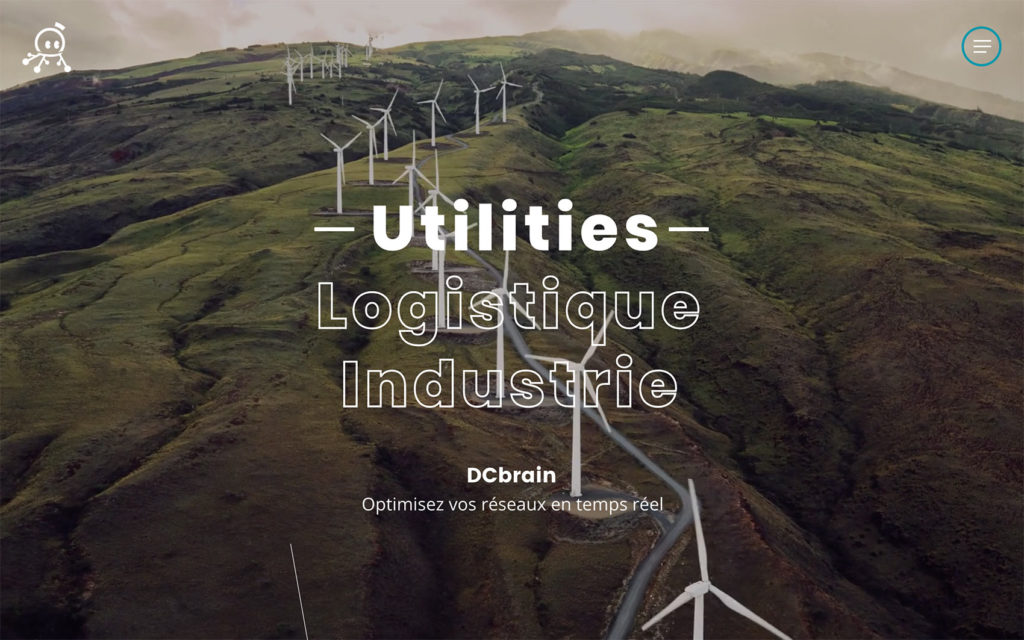
DCbrain is the Artificial Intelligence specialist applied to Energy and Logistics networks allowing industrial companies to optimize, forecast and make reliable flows to obtain operational recommendations in real time.
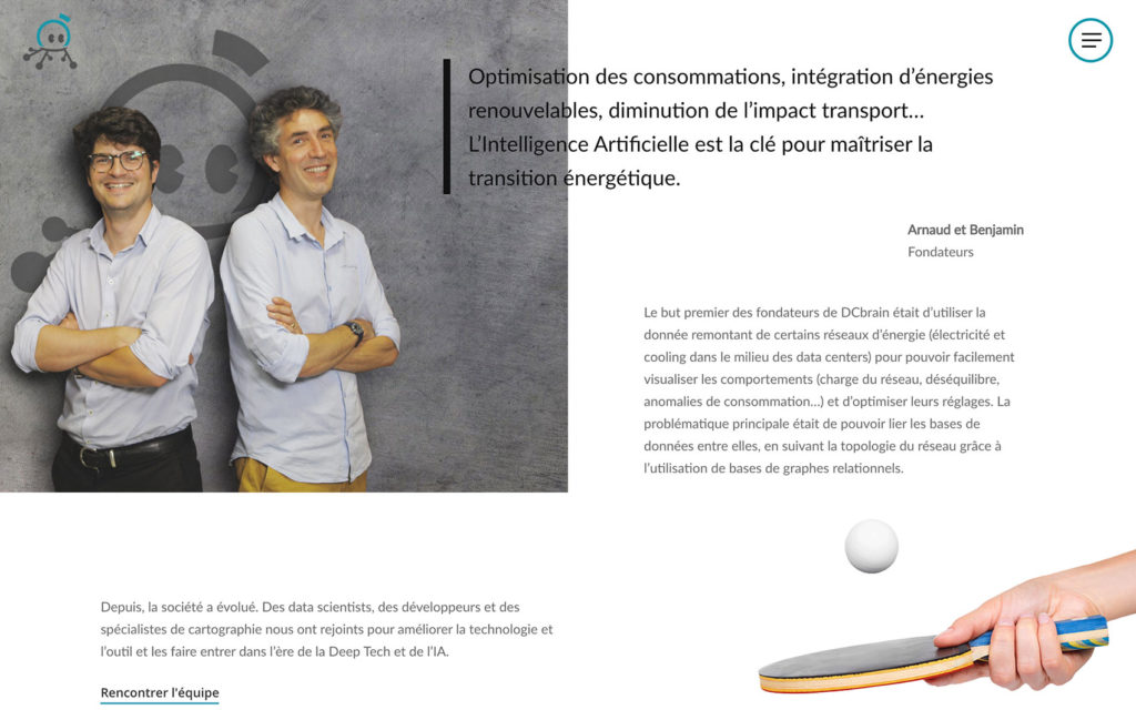
As the startup recently raised funds it grew up significantly and started to work with the biggest french companies using networks. DCbrain needed a brand new identity starting with a modernization of the logotype. Then a new website was needed, as well as a demo video showing up their new services.
What we delivered
Identity
The new logotype had to convince the whole team that was really attached to the old one, as well as the new investors. After few atemps we decided to stay really close to the old one, but to really simplify the shape and to modernize all elements.
Logotype
After proposing different approaches, it was hard for the client get rid of his previous image. Therefore he finally wanted to keep the shape of the brain headed logotype he had before. We managed to modernize it and make the whole team happy, which was quite the challenge.
Old logotype
New logotype
Colors
The client wanted to keep the same colors as the previous logotype, so we just turned them in more sober way so that it would fit well with the new modern identity.
Dark green
#0089A4
Dark grey
#515252
White
#FFFFFF
Typography
We chose the Poppins typography for the titles, so that we have a modern feeling through the whole identity, as well as dynamic like the startup. We used the Lato typography for paragraphs, which was well adapted for the future users of the website who need very easy to read supports.
Poppins
A B C D E F G H I J
a b c d e f g h i j
0 1 2 3 4 5 6 7 8 9
Lato
A B C D E F G H I J
a b c d e f g h i j
0 1 2 3 4 5 6 7 8 9
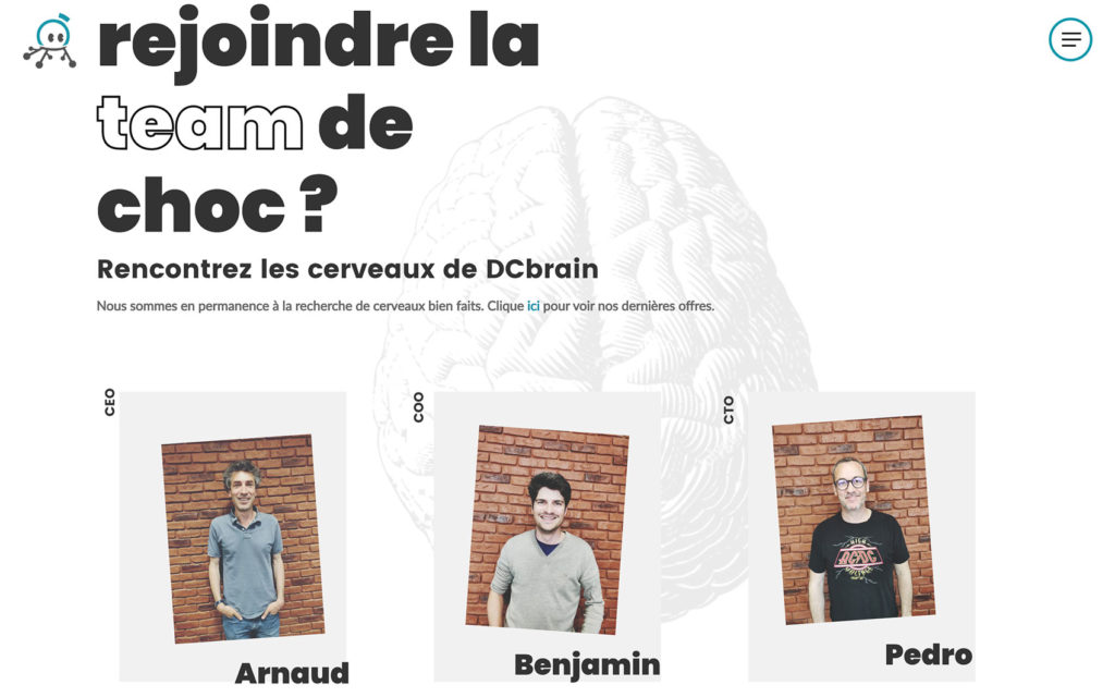
Website
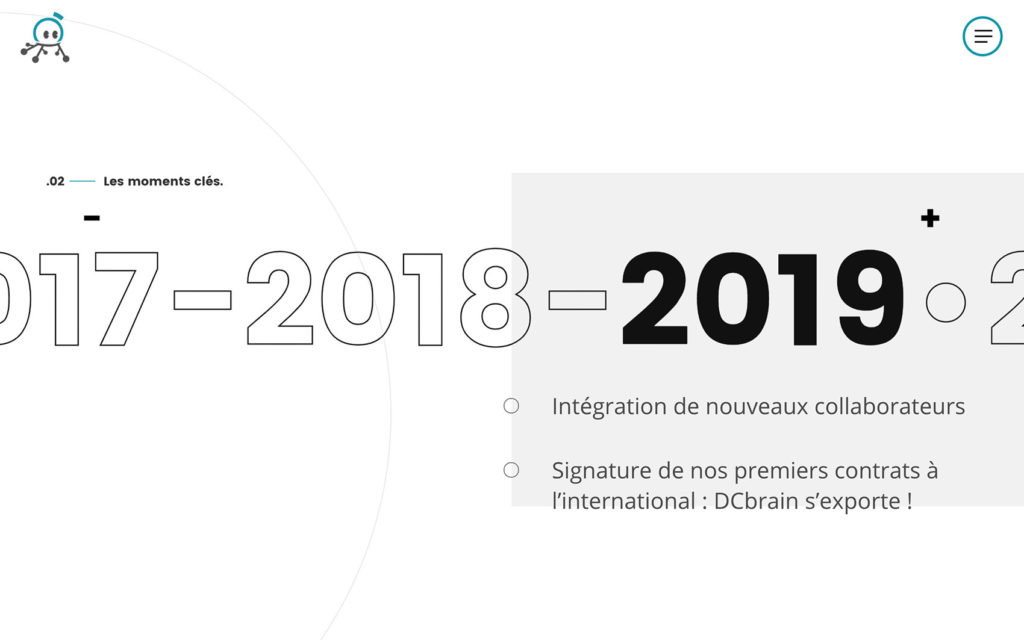
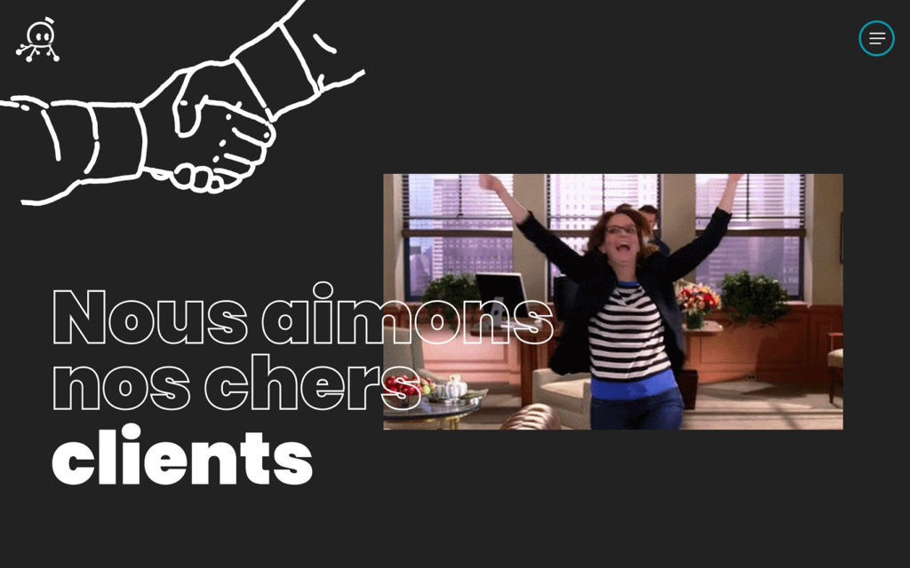
The website was built upon this new identity, offering to the user a real immersive experience. Lots of elements play with this network message that contains the logo and on which their service is focused on. Add few nice animations and fun elements to bring a touch of feel good startup, even if those king of services aren’t generally seen this way.
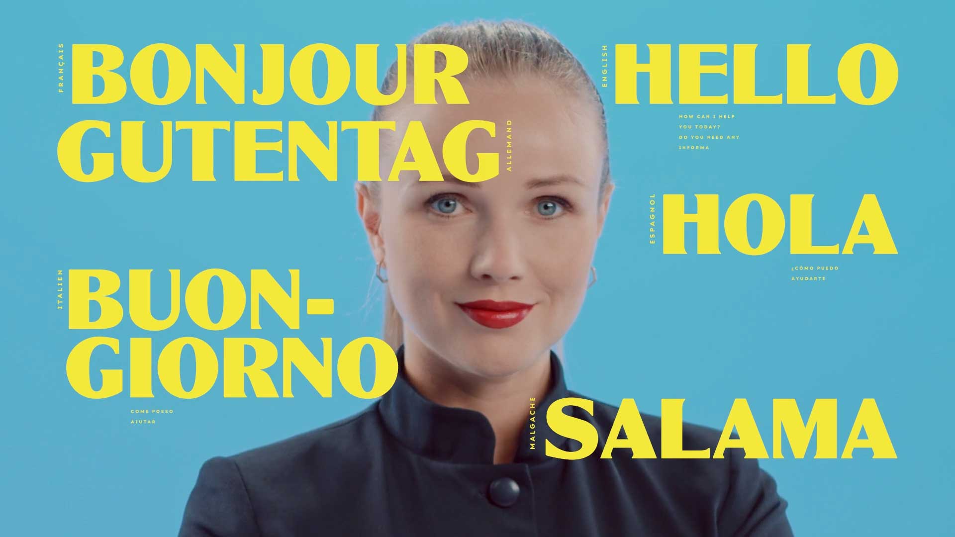
Video
Next came a video demo on what exactly permits their software, using motion design only and centered on the software itself, using the logotype as a friendly helper.